Writing a novel is a solitary business. It's all about getting the story out of your head and onto the page. But what about the pictures you have in your head, the images you see as you tell your tale? That's a little trickier. Especially when it comes to the critical design of the book's cover.
Fortunately, I got connected with the immensely talented Larry Geiger of Larry Geiger Design. I am thrilled with the result -- and judging by the comments we've already received about the cover for PHOENIXVILLE RISING, so are you!
I thought you'd enjoy reading the story behind this "spectacular" cover ...
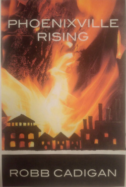
An instructor at a writing workshop I attended many years ago suggested writers should visualize their own book jacket as they're working. To that end, I created this mockup of my book cover and posted it above my computer. It served its purpose and provided helpful motivation as I headed for the story's finish line.
When it came time for an actual cover, I had a clear vision of what I wanted -- AND I knew I needed a professional designer to make it happen.
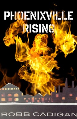
Fortunately, I started working with Larry Geiger at Larry Geiger Design. Larry did the terrific cover design for the CHESTER COUNTY FICTION anthology and I loved his work on that book and other creative projects.
Larry liked my initial concept for the cover--the death and rebirth of a man and a town--so we started looking for stock photographs of a phoenix rising from the ashes. Nothing was quite right. Everything looked a little too "fantasy" or Tolkien-esque. It was frustrating. We couldn't translate the image in my head onto the page.
Then, Larry suggested he illustrate the firebird himself.
This was a quick first pass, just to show what he might do.
I loved it.
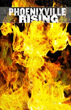
This was one of Larry's first full versions of the firebird and I thought it served the critical dual purposes of catching the reader's eye and supporting the novel's theme of rebirth and resurrection. We tweaked the definition and colors.
At this stage, we also started to play with typefaces and placement. We liked the feeling of a typeface that was hand-drawn or painted, in keeping with one of my key characters, who is an artist.
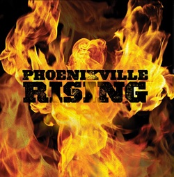
We experimented with other fonts and title treatments across the firebird's chest. We tried different colors as well. All in an effort to make sure the cover grabbed attention and the title stood out -- especially when shrunken down to postage-stamp size, as it will be on amazon.com.

This was the design that really made it all seem real. Larry texted this to me late one night and I just stared at it. The image I'd had in my head for so many years was now right in front of me. The book finally had a cover.
There was one remaining issue: although I loved Larry's perfect illustration of Phoenixville's iconic foundry building, I didn't think the silhouette said "milltown" enough. Still a little more work to do.
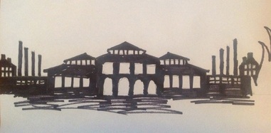
I was very fortunate to find a designer who wanted to work in a spirit of collaboration. One morning, using some of Larry's earlier illustrations as a guide, I drew this silhouette of the milltown I was envisioning and emailed it off to Larry. We were almost there.
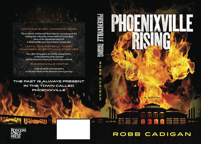
The final result, with the full panorama of the town stretching across the front and back covers. The image of rebirth/ascension, the milltown silhouette, the treatment of the promotional copy on the back, and of course the majestic firebird ... it all works. And I couldn't be happier!
(Note: There is even a space at the top of the back cover for a quote from a New York Times-bestselling author who read the book. But you'll have to wait for another blog post to find out more about that!)

 RSS Feed
